MetricGrid
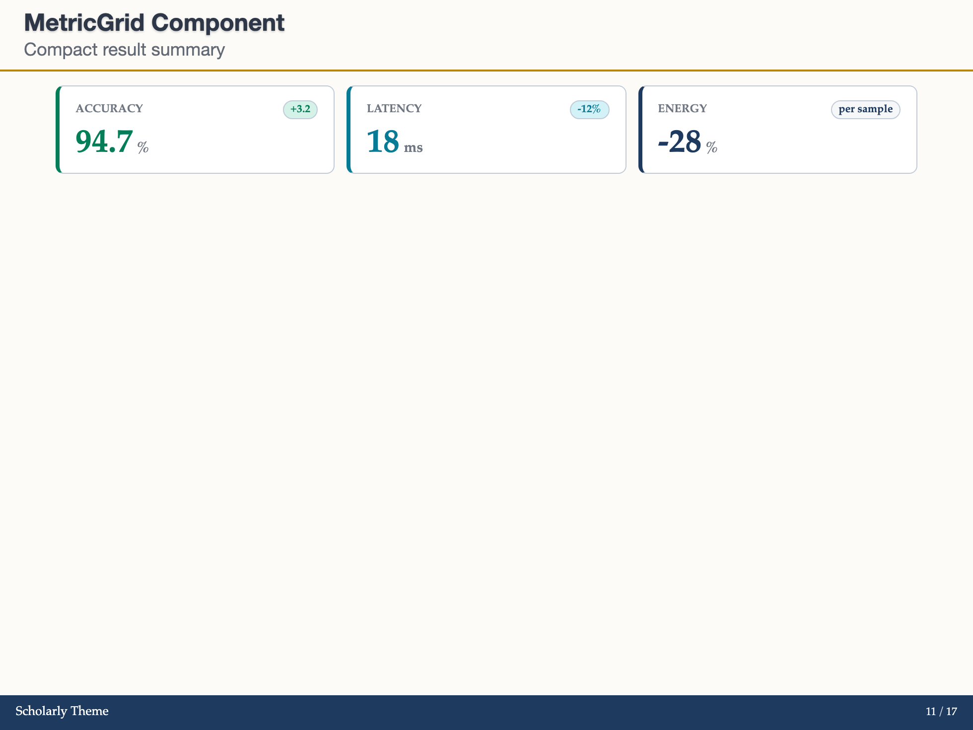
MetricGrid arranges several MetricCard items in a grid with an explicit column count for result summaries, ablations, or experiment overviews.
Basic Usage
markdown
<MetricGrid :columns="3" :metrics="[
  { label: 'Accuracy', value: '94.7', unit: '%', delta: '+3.2', variant: 'success' },
  { label: 'Latency', value: '18', unit: 'ms', delta: '-12%', variant: 'info' },
  { label: 'Energy', value: '-28', unit: '%', delta: 'per sample', variant: 'primary' }
]" />
Mixed With Custom Cards
markdown
<MetricGrid :columns="2">
  <MetricCard label="Macro F1" value="91.2" unit="%" delta="+1.4" variant="success" />
  <MetricCard label="Calibration" value="0.04" unit="ECE" caption="Lower is better" />
</MetricGrid>
Props
| Prop | Type | Default | Description |
|---|---|---|---|
metrics | MetricItem[] | [] | Metric objects rendered as cards |
columns | number | string | 3 | Number of columns, clamped from 1 to 4 |
gap | string | number | '0.75rem' | Space between cards |
variant | string | 'primary' | Default card variant |
compact | boolean | false | Use compact card spacing |
columns stays fixed as the Slidev canvas scales with the browser. Choose fewer columns or split the content across slides when labels become hard to read. Numeric gap values use rem.